Laundry Room 356 at Ronald McDonald House – Stanford
by Alden Miller | July 6, 2015 | Noteworthy, RMH Stanford - "Where Hope Has a Home"
As I announced last month, I am thrilled to be participating in the Ronald McDonald House project: Where Hope Has a Home. Alden Miller Interiors will be contributing the design for Laundry Room 356 and Guest Suite 307. Over the past months, we have been gathering ideas for these rooms on Pinterest and will be using these boards as a way to develop the designs and share the gifts that are given towards our portion of this great project. Although the gift of thoughtful design is a lot, we will also be fully furnishing these rooms as part of our design work. In addition to the vendor contributions and donations, I will soon be launching a fundraising campaign gathering funds to help make these ideas happen. I will be asking for your help in the upcoming week, however I want to start by explaining the designs we have for these rooms. This post outlines the design concepts for the laundry room. You can check out the images gathered for this design on our Laundry Room 356 Pinterest board and read more about it all below.
Often times, utilitarian spaces, like laundry rooms or garages, are given minimal attention during the design process and material selection. Yet we live a lot of our lives in these mundane spaces, and like kitchens and bathrooms, why not make these spaces a little more inviting and a little more fun? When I saw Laundry Room 356 on the list of rooms at the Ronald McDonald House Stanford project, I saw an opportunity to bring enjoyment to one of these chore-filled locations. Similar to the Noe Valley Laundry Room, I want Laundry Room 356 to not only function well for laundry needs, but provide motivation for the task, a sense of community and a continuity to human culture.
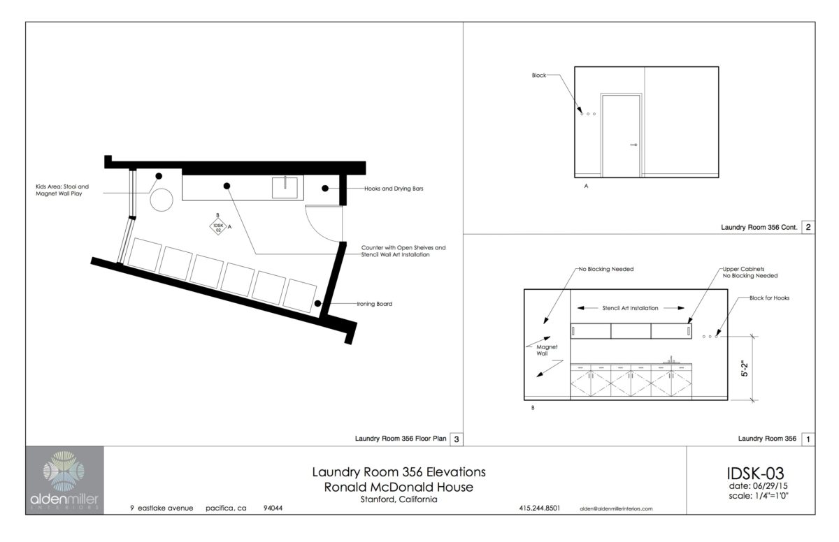
Our Plan for Laundry Room 356 at the Ronald McDonald House, Stanford Project –Where Hope Has a Home.
Like laundry rooms that service large groups of people Laundry Room 356 has one full wall dedicated to stacked washers and dryers. During the tour of the existing Ronald McDonald House in Palo Alto, I listened to the concerns staff had with the usability of their current laundry room and observed its shortcomings. A couple big differences are a very important part of my design:
Function and Culture
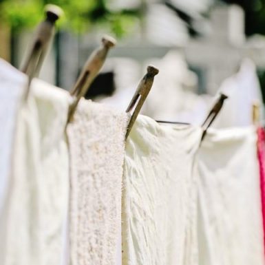
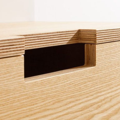
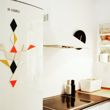
First there needed to be a large portion of dedicated counter space which had been lacking and was sorely missed in previous laundry spaces. Another functional concern was that there needed to be a way to tell loads of laundry apart, so we integrated a magnetic label system both for the storage space and as a way for marking loads in the washer and dryers. The upper storage is limited to a long narrow wall cabinet and sliding doors that allow for modern, open space. For both this and the lower cabinets the exposed multi-ply frame show the craft behind the product. This, along with other classic laundry elements planned into the decor – like a drying line with clothes pins, pantry mesh and wall art – provide homage to this perpetual routine. With this nod to history and the hands that craft things, people are reminded they are part of something bigger than just themselves.
Design that Provides Motivation
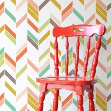
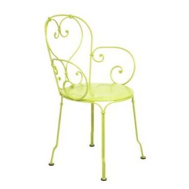
Second, as mentioned above, I wanted the space to provide lines and colors that gave joy to this task-oriented room. A feeling of energy and movement can help make a room conducive to productivity rather than bringing residents down with a mundane utilitarian tone. We are achieving this mostly through one wall that features an irregular chevron pattern. The steel color in the palette gives strength and utility where the red-orange and citron provide energy. We selected a chair from Fermob that add to this design concept, both in color and shape.
A Sense of Community
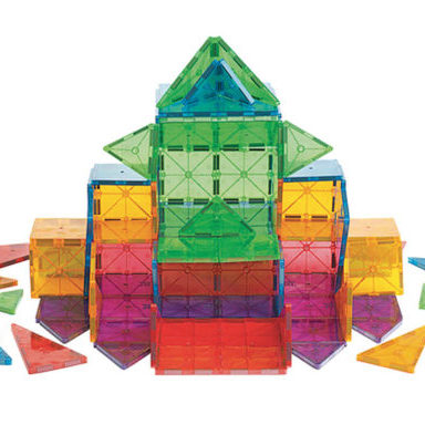
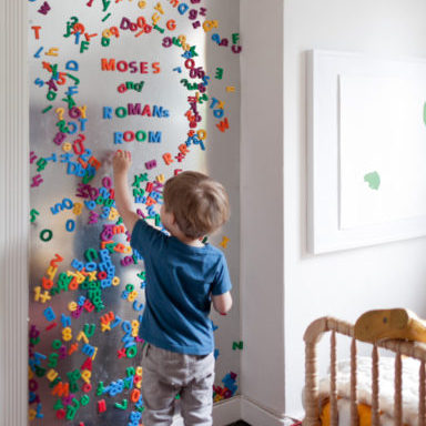
Lastly, I felt it was important to bring community into this public-use space so the chores need not be isolating. Sharing space can be awkward or it can be rewarding. Often parents will be accomplishing these chores along with other families and the siblings of their child seeking care. Using the jog in the structural wall of the floor plan, we incorporated a magnet wall to entertain kids, and a small seating space to encourage conversation. The magnet activity wall doubles as a way to store the magnet markers for the label system. I’ve had great feedback from families in which I have incorporated magnet walls into the design of the children’s spaces. My favorite use of one such magnet wall was a client’s kid who built a ‘house structure’ projecting off the wall with magnatiles. It was awesome!
To contribute to our portion of the Ronald McDonald House project at Stanford go to Alden Miller Interiors’ Donation page.

