Designing With a Single Color
by Alden Miller | July 4, 2013 | Design Lab
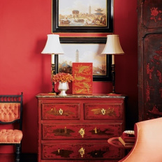
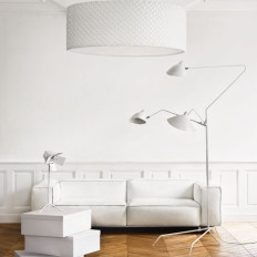
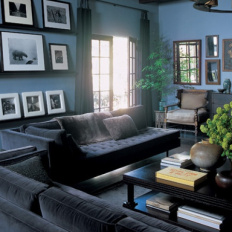
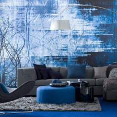
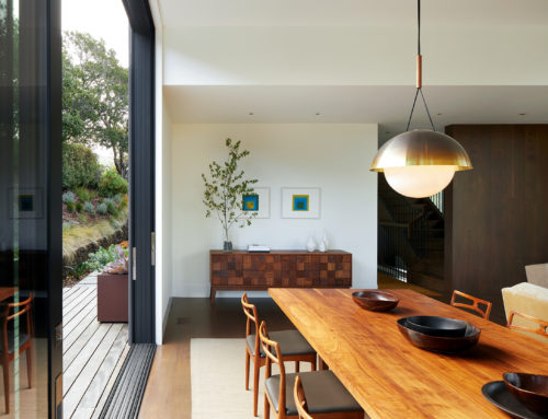
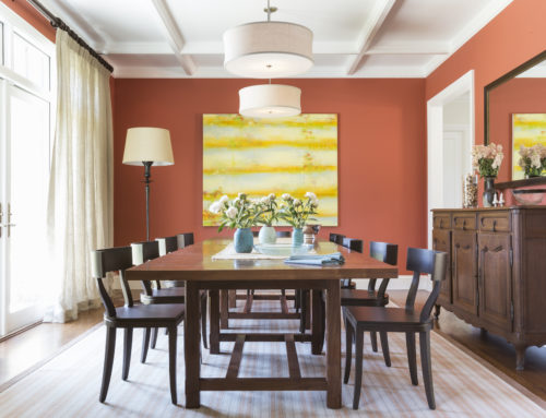
A monochromatic color scheme sticks to just one color from the color wheel. The similar color provides the unifying element important in all design. Monochromatic color schemes intensify whatever mood is being created. A room with some blues in it will feel cool but an all blue room will be completely tranquil. A room with some red pillows will be fun and lively. But an all red room will be intense, evoking thoughts of adventure or our most visceral urges (they say red makes people hungry so it’s often used in restaurant design). White in a room keeps things bright and fresh but an all white room is pure elegance.
The above rooms successfully use monochromatic color schemes, red, white and blue chosen of course for the Fourth of July holiday.
3 Rules for Monochromatic Color Schemes
Color concepts can be specific colors or they can be broader targets like warm tones, soft neutrals or pops of intense color. Color concepts can also be textbook color schemes, like complementary color schemes or monochromatic color schemes. The monochromatic color scheme is easy to identify but can be difficult to execute. Follow these guidelines when developing your palette no matter what the scheme, but especially with designing with a single color.
Rule 1: Use Something as a Target Point for Your Scheme
You can use a piece of art, an attractive blanket, or an image of a room you like. This selection is your lighthouse and acts to guide your choices along the whole process. I often start with fabrics or paint chips because they are easy to shift around and look at together. I love it when a client has a piece of art or a picture from a magazine that really speaks to them. Take this little bird, for example.
Rule 2: Get Exact Samples of Every Part
When using all one color there is a high risk that the colors will look a little off together. Especially whites. It is surprising what a broad range of whites there are, and these subtle differences can be very sophisticated but can also just look bad. By making sure to have actual samples of all the materials together in one place you can be sure that the tones work well together. For example people will not often think to check how their stone or tile will look with the color of the white sink, toilet or tub because those are accepted, standard whites. But this comparison can be just as important as the color of the door trim vs the wall.
With online shopping this is tough. I suggest buying some things first and then bringing it with you to choose other selections in person. As hard as it is to wait, if the option is available, always take the time to get a sample sent in the mail.
Rule 3: Find Variety Within Your Singular Color Scheme
Excellent design has unity but it also has variety, even in the most strict monochromatic schemes.
This variety can be gained by blending in a wood tone to contrast with the scheme, or create texture. Using a variety of textures can be hard because you want the repetition of the texture to be read differently from one item to the other. A heavy linen basket weave is set off nicely on a smooth, tight cotton, whereas it will get lost if the second fabric also has a strong texture.
A white bathroom is a common monochromatic color scheme and the size of the tile is very important. Tile and stone don’t have as many textural varieties as fabric does so the rhythm created by the tile size creates the interest. If I am using a smaller tile on the walls I will use a medium to larger tile on the floor, or visa versa.
Lastly you can have a broad range to your single color. If you are doing oranges you can have it range from yellow-orange to red orange and there will be more depth to the pallet. Be careful though, as you don’t want to cross certain points on the color wheel. Yellows and oranges work with orange-tinged reds but not with bluish reds. It’s the same with greens. Yellow-greens should stay together and not be mixed with greens that have more blue in them like spruce or aqua. In most cases…there are exceptions, but leave those up to the pros.

