Montara Project Master Bath
by Alden Miller | October 3, 2013 | Design Lab, Kitchens and Baths, Montara - A Mountain Escape, Projects + Press

Once the kids’ bath was fully functioning for the Montara Project we began work on the master bathroom. Even from the start it was clear that the master bath was a sore point. It was dark, despite being on the southeast side of the house, and it had old, unflattering materials (including a shower that was a small hole in the wall). It was laid out like a long hall divided up into three compartments, possessed nothing special to make it feel like a master bath, and its meager storage had it feeling cluttered. Brad commented about Melanie’s “stuff” on the counter. However, in reality it wasn’t bad habits — but bad design.
We kept the above issues in mind and created a program that was aimed at remedies and enhancements. We would (1) open up the dark, divided room (2) select modern materials to create a worthy master bathroom, and (3) deal with the lack of storage (thereby removing clutter).
Letting the Light Shine In
The initial layout was comprised of a vanity cabinet with a small transom window above the sink. In the center of the stretch was a drop-in style tub that required a surface of tile all the way around (even in the front) which used up much needed space. There was a full-height wall between the vanity and the tub, and on the other side as well. This not only made the space dark and disconnected the bathroom, but also made the master tub feel like a tub/shower situation you’d find in a secondary bathroom.
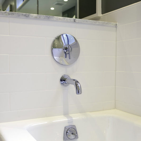
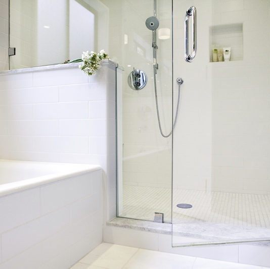
We wanted to create a plan that didn’t involve moving any significant plumbing. So we bumped out the corner of the bathroom for the old dumbwaiter shaft, and capitalized on that space to double the size of the shower. With the new plan there was so much light beaming in and being reflected, that we were able to add depth with the color of the walls with Benjamin Moore ‘Cos Cob Stonewall’. The result was both sophisticated and romantic, open and cozy.
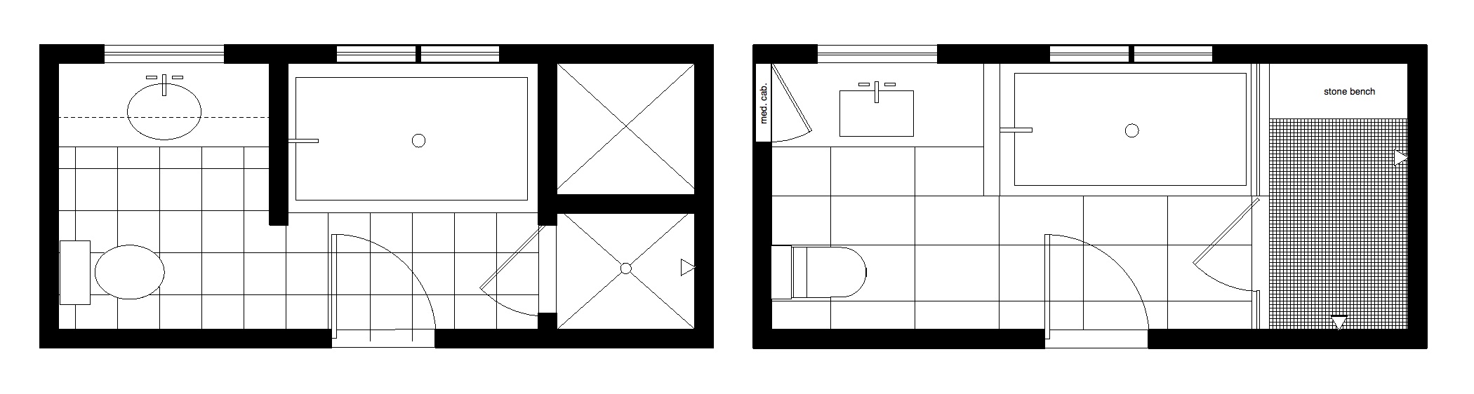
Before (Left) and After (right): The full height walls were made into half height and let the light shine through the room.
Setting the Tone
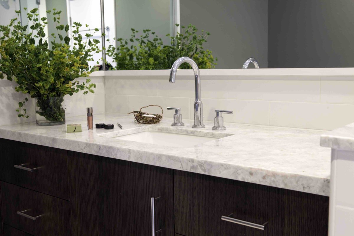
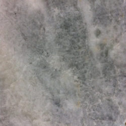
Finishes and details set the tone of a bathroom. Going with my typical first step for bathroom material selections, I started with the countertop. I fell in love with a stone called ‘White Pearl’ I found at Marble Unlimited. Brad and Mel fell in love with it too.
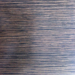
Playing with a “sophisticated meets natural” idea, we chose a stain for the cabinets that turned them into a twist on something common and had an ever so slight tint that picked up the green in the stone. The wood was common oak (white oak though, stay away from dated red oak) but the stain was dark and complex.

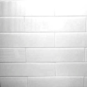
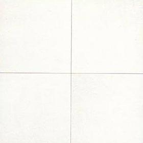
The wall tile we chose was also a modern twist on traditional. The long tiles were a new and different shape, but laying them running bond (staggered) made it familiar. The size of the stone floor tile in the bathroom and in the shower, was selected to create variation while keeping with the color white. This theme and variation created a rhythm and pattern involving the tub, shower and floor.
The design and selections were based on the original theme. First, we extended the idea of combining traditional and modern with details of the stone overhang on the half height walls (traditional), mixed with the details of the medicine cabinet and shower niches (modern). High contrast can convey traditional or sophisticated but the simple materials we chose, along with the clean detailing, made the feel of the room casual and available.
Better Living

The narrow sink cabinet allows for wide drawers on both sides.
A well designed space lets you live better. As I picked up from Brad’s comment, a major concern was the clutter. Melanie had many products she liked to use, and the existing storage options did nothing to help her: the drawers were too few in number and overly deep (not useful for eyeliner and nail polish); the free-standing open shelves, situated above the toilet, were uncomfortable to use — and definite eyesores.
As a remedy, I started by placing a single reasonably-sized sink in the center, and designed the middle cabinet door as small as possible leaving plenty of space for wider drawers on both sides. In bathrooms, I like to stack four equally-sized drawers because the depths become more comfortable and useful for storage. In addition to the drawers, we mounted a huge, built-in mirrored medicine cabinet on the vanity’s side wall. The cabinet was perfect for cosmetics, and it was the first thing Brad showed me (“look, no mess”) as he opened it up to show me how everything nicely now had a spot.
We took a moment to absorb the tranquility of the new master bathroom and then turned our attention to the main entryway and the powder room.